7 Outdated Wedding Color Themes to Avoid
Selecting wedding color themes is one of the first major design choices couples face during the planning process. The colors you choose will influence everything from floral arrangements to bridesmaid dresses and table linens. However, wedding decor colors evolve rapidly, leaving some previously beloved palettes looking tired and out of style. If you are looking for fresh wedding color ideas, it is helpful to know which combinations have had their moment in the spotlight. Here is a look at seven outdated wedding color themes to avoid if you want a timeless, modern celebration.
1. Bubblegum Pink and Chocolate Brown
In the early to mid-2000s, it was nearly impossible to attend a wedding without encountering the classic combination of bubblegum pink and chocolate brown. This pairing was featured heavily on invitations, fondant cakes, and satin chair sashes. While it was considered playful and sophisticated at the time, it now heavily dates a wedding to a very specific era. The stark contrast between the heavy brown and the youthful pink often feels clunky by modern design standards.
Instead of this rigid duo, modern trends lean toward more organic and fluid color stories. If you love pink, consider blending soft blush, dusty rose, and terracotta for a dimensional, romantic feel. If you prefer earthy tones, swap the heavy chocolate brown for subtle taupe, warm beige, or even a rich espresso paired with creamy white and lush greenery. These subtle shifts create a much more elegant and timeless atmosphere.
2. Stark Black and White Damask with Red Accents
Another casualty of early internet wedding planning was the overwhelming popularity of black and white damask patterns paired with bright red accents. This bold, graphic look dominated reception halls, appearing on table runners, backdrop drapery, and even the bridal party attire. The intense contrast of these three colors creates a highly dramatic environment that often feels more like a corporate event or a theatrical stage set than a romantic celebration.
For a sophisticated evening wedding, you do not have to abandon black and white entirely. The key is to soften the execution and drop the harsh red accents. Opt for a classic black-tie aesthetic with crisp white linens, matte black flatware, and an abundance of warm candlelight. If you want to introduce a third color, look toward muted metallics or deep jewel tones like emerald green or navy blue, which add depth without overwhelming the senses.
3. Mint Green and Coral
Around the early 2010s, mint green and coral became the undisputed champions of spring and summer weddings. This bright, preppy combination flooded inspiration boards and was frequently used for bridesmaid dresses, groomsmen ties, and signature cocktails. While cheerful, the high saturation of both colors competing for attention can make the decor look slightly juvenile or excessively trendy. Because it was so ubiquitous, it now feels distinctly tied to a bygone decade.
To achieve a similarly fresh and summery vibe without the outdated connotations, consider softening the palette into gentle pastels or earth tones. Sage green and muted peach offer a much more sophisticated take on this aesthetic. These softer shades mimic the colors found in nature, allowing your floral arrangements to look organic rather than artificial. You can also anchor these colors with neutral ivory or subtle wood textures for a more grounded design.
4. Overly Saturated Purple and Silver
For years, royal purple and metallic silver were the go-to choices for couples wanting a regal, luxurious wedding. This combination often translated into shiny satin chair covers, glittering rhinestones, and vibrant purple uplighting that washed out the entire reception room. The heavy reliance on synthetic fabrics and bright LED lighting created a look that feels extremely harsh and artificial by today's softer, more natural wedding standards.
Purple is still a beautiful option for wedding decor colors, but the application requires a lighter touch. Moving away from highly saturated eggplant and blinding silver is the first step. Consider incorporating a gradient of lavenders, dusty mauves, and deep plums to create visual interest. Instead of shiny silver, pair these purples with brushed nickel, champagne gold, or simply let lush green foliage serve as the primary complementary tone.
5. High-Contrast Neon Brights
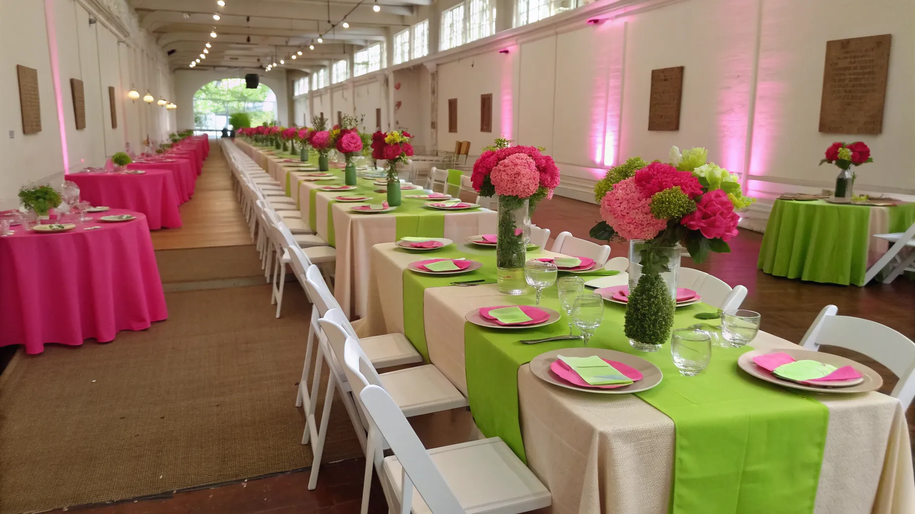
There was a brief period when neon colors like electric blue, hot pink, and lime green were considered a fun, edgy choice for modern weddings. These colors were often used in geometric patterns, acrylic signage, and intense floral installations. However, neon palettes can be incredibly taxing on the eyes and notoriously difficult to photograph well. The fluorescent glare often bounces off surfaces, casting unflattering shadows and tints on the skin tones of the wedding party and guests.
If you want a vibrant, colorful wedding, there are much better ways to achieve a lively atmosphere without resorting to neon. Embrace rich, sun-baked colors like mustard yellow, burnt orange, and vivid magenta. These colors pack a punch but still exist in nature, making them much easier to weave into floral arrangements and table settings. A bold, citrus-inspired palette feels joyous and energetic while maintaining a level of elegance suitable for a milestone event.
6. Burlap Brown and Lace Ivory
The rustic chic trend brought about an avalanche of burlap and lace decor, resulting in a brown and ivory color scheme that dominated barns and outdoor venues for years. While the intention was to create a cozy, laid-back environment, the overreliance on burlap table runners, twine-wrapped mason jars, and wood slices quickly became a cliché. The monochromatic brown and beige palette often looked flat and lacked the celebratory brightness typically associated with weddings.
You can still host a beautiful, rustic-inspired wedding without falling back on these specific wedding colors to avoid. Update the country aesthetic by incorporating richer textures and tones. Replace burlap with soft linen or flowing chiffon in earthy hues like terracotta, sage, or slate blue. Introduce varied textures through colored glassware, taper candles, and seasonal fruits used as table decor. This approach honors the rustic setting while elevating the overall visual experience.
7. All Metallic Everything
A theme consisting entirely of gold, silver, and rose gold was once viewed as the pinnacle of glamour. Couples would incorporate metallic elements into every possible detail, from foiled invitations and sequined tablecloths to gilded chairs and spray-painted foliage. The result was often overwhelmingly reflective and visually chaotic. An entirely metallic palette leaves the eye with no place to rest, turning what should be a luxurious ambiance into a gaudy spectacle.
Metallics are best used as accent colors rather than the main event. To modernize a glamorous wedding, choose a solid, neutral base like charcoal grey, deep navy, or creamy ivory. Then, apply metallics thoughtfully and sparingly. A gold-rimmed charger plate, elegant brass candlesticks, or delicate foil lettering on the menus can provide the perfect amount of sparkle. Mixing metals, such as pairing brushed brass with antique silver, also adds a contemporary, curated feel to your wedding design.