6 Color Mistakes That Make You Look Older
Color is one of the most powerful tools in fashion and beauty, capable of completely transforming how a person is perceived. When used correctly, the right shades can brighten the complexion, highlight features, and provide a healthy glow. Conversely, certain color choices can cast unflattering shadows, emphasize fine lines, and drain the natural vitality from your skin. Understanding the colors that make you look older is a crucial step in refining your personal style and ensuring your wardrobe works for you rather than against you.
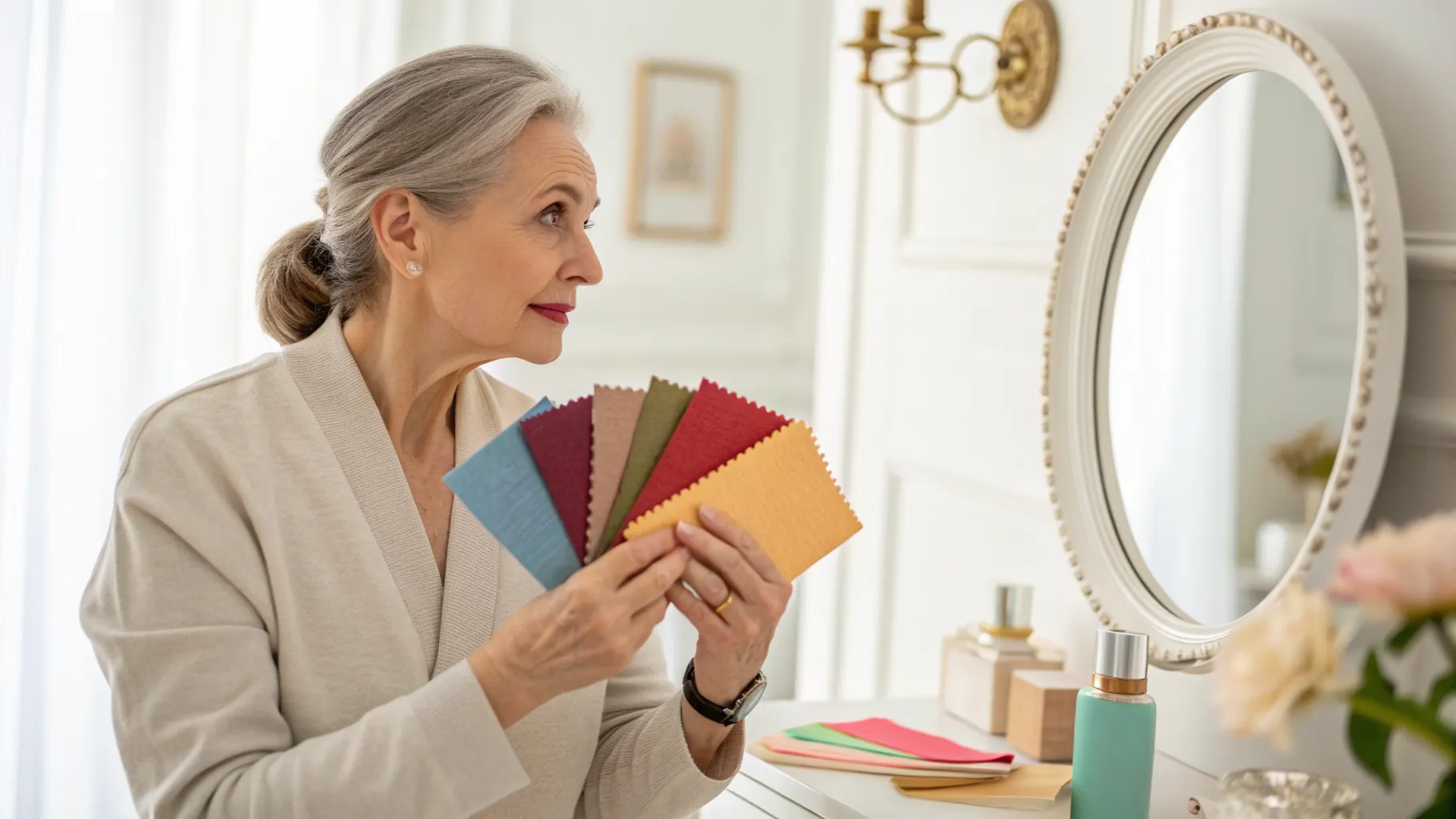
Wearing Too Much Black Near the Face
Black is often praised for its slimming effect and timeless appeal in the fashion world. However, as skin matures, it tends to lose some of its natural luminosity and can become paler or more translucent. Wearing stark black directly against the face can create a harsh contrast that highlights fine lines, dark circles, and uneven skin tone. This is one of the most common color mistakes that age you, as the severe contrast draws attention to shadows rather than illuminating the face.
Instead of giving up black entirely, individuals can soften the impact by keeping dark shades away from the neckline. Incorporating scarves, statement necklaces, or collars in softer, more flattering tones creates a buffer that illuminates the face while allowing the wearer to enjoy their favorite dark garments. Navy blue, deep charcoal, or rich espresso are also excellent alternatives that provide the sophistication of black without the harsh draining effect on the complexion.
Relying Exclusively on Pastels
Pastel colors are frequently associated with youth and springtime, which leads many to believe these shades will automatically create a younger appearance. In reality, powdery pinks, baby blues, and pale lavenders can wash out the complexion, especially for those with cooler or fairer skin tones. This washed out effect can make the skin look dull, tired, and lacking in natural vitality, essentially creating a style color mistake that does the exact opposite of its intended purpose.
A better approach involves opting for mid tone colors or jewel tones that provide more depth and richness. Shades like emerald green, sapphire blue, or rich berry add vitality to the skin without overwhelming the natural complexion. If pastels are strongly preferred, they are best worn on the lower half of the body or utilized as minor accents in accessories, keeping the more vibrant or grounding colors closer to the face.
Choosing the Wrong Shade of Gray
Gray is a versatile neutral that many people transition to when they want a softer alternative to black. The problem arises when the specific shade of gray closely matches the wearer's natural hair color or skin undertone, which can result in a monochromatic, aging effect. A flat, matte gray can drain the color from the face and emphasize signs of aging, making the wearer look faded rather than stylishly understated.
To wear gray successfully, it is important to understand personal undertones and choose a shade that offers some contrast. Warm grays like taupe or charcoal often work better for warmer skin tones, while cooler, silvery grays complement cool undertones. Pairing gray clothing with a pop of vibrant color near the face, such as a bright scarf or a bold lip, also helps maintain a lively appearance and breaks up the monotony of the neutral shade.
Matching Makeup Colors Too Closely to Clothing
The practice of perfectly coordinating eyeshadow or lipstick with an outfit was once considered a hallmark of a meticulously planned wardrobe. Today, this overly matched approach can look dated and rigid, which inadvertently ages the wearer. For example, wearing blue eyeshadow to match a blue dress often draws attention away from the eyes and focuses it entirely on an outdated beauty color guide technique. Modern beauty aesthetics favor complementary or neutral makeup palettes that enhance natural features rather than mimicking wardrobe choices. To avoid this aging trap, consider these updated approaches:
- Use neutral earth tones for eye makeup regardless of the colors present in your outfit.
- Choose lip colors that complement your natural skin undertone rather than attempting to match your shirt.
- Keep blush shades soft and natural to mimic a healthy flush rather than coordinating with bright clothing.
- Focus on enhancing one feature, like a bold lip or a smoky eye, rather than matching everything at once.
Ignoring Your Seasonal Color Palette
Everyone has a unique combination of skin tone, eye color, and hair color that dictates which shades look best on them. Ignoring these natural traits and wearing colors that clash with your personal palette is a major error in any style color mistakes guide. For instance, someone with warm, golden undertones wearing icy, cool blues may look pale and unwell, while someone with cool undertones might look slightly jaundiced in mustard yellow or rust orange.
Determining your seasonal color palette involves identifying whether your undertones are warm, cool, or neutral, and whether your overall features are light or dark. Once this baseline is established, selecting colors from the appropriate palette ensures that your clothing reflects light positively onto the face. This harmony minimizes shadows, evens out the appearance of the skin tone, and creates a naturally glowing complexion that looks inherently youthful and vibrant.
Overusing Harsh Neon Colors
Neon colors are vibrant, energetic, and undeniably eye catching. While they might seem like a great way to inject a sense of fun and youthfulness into a wardrobe, they often have the opposite effect on mature skin. The extreme brightness of neon shades casts harsh, unflattering reflections onto the skin, magnifying imperfections, highlighting redness, and creating a severe look that overwhelms the wearer's natural features.
Those who love bright colors do not have to resort to neon to make a bold statement. Rich, saturated colors offer the same level of visual interest but are much kinder to the complexion. Colors like true red, cobalt blue, or bright coral provide a sophisticated vibrancy that enhances the wearer's appearance without the glaring, artificial intensity of neon hues. These saturated shades draw the eye while remaining elegant and highly flattering.