7 Outdated Wedding Color Themes to Avoid
Choosing a wedding color palette is a crucial step in the planning process, as it sets the visual tone for the entire celebration. Over the years, wedding trends have evolved significantly, moving away from rigid, overly matched color schemes toward more organic and nuanced combinations. For couples currently planning their special day, understanding which palettes have fallen out of favor can be a helpful tool in creating a timeless and elegant event. This helpful information guide explores 7 outdated wedding color themes to avoid, offering insight into why they feel dated and how modern celebrations are shifting toward fresh alternatives.
1. Neon Pink and Lime Green
In the early 2000s, vibrant and highly contrasting color pairings were incredibly popular for spring and summer weddings. Neon pink and lime green, in particular, dominated reception halls, bridesmaid dresses, and floral arrangements. While these colors certainly bring high energy to a room, they often compete for attention and can overwhelm the visual space. Photographs from weddings utilizing this scheme frequently look harsh, as the artificial nature of neon hues does not blend naturally with softer wedding elements.
Today, couples are leaning toward softer, more muted interpretations of these bright tones. Instead of neon pink, dusty rose or muted magenta offers a sophisticated touch. Similarly, sage or olive green provides a grounding, earthy feel that acts as a neutral rather than a neon focal point. This shift allows the overall aesthetic to feel more relaxed and visually cohesive.
2. Chocolate Brown and Tiffany Blue
This specific combination was once the pinnacle of wedding elegance, heavily featured in stationery, cake designs, and table linens. The stark contrast between the deep, rich brown and the bright, iconic blue created a striking visual that many couples loved. However, because it was so widely used over a short period, it quickly became a visual cliché associated heavily with a very specific era of wedding planning. The heavy use of dark brown as a base color can also make reception spaces feel unnecessarily dark or heavy.
Modern wedding design favors lighter, more organic neutrals to anchor a colorful accent. Couples who love blue are now pairing varied shades of dusty blue or French blue with warm whites, taupes, or light stone gray. This allows the blue to shine without the heavy anchor of chocolate brown, resulting in a lighter and more airy atmosphere.
3. Stark Black and Pure White
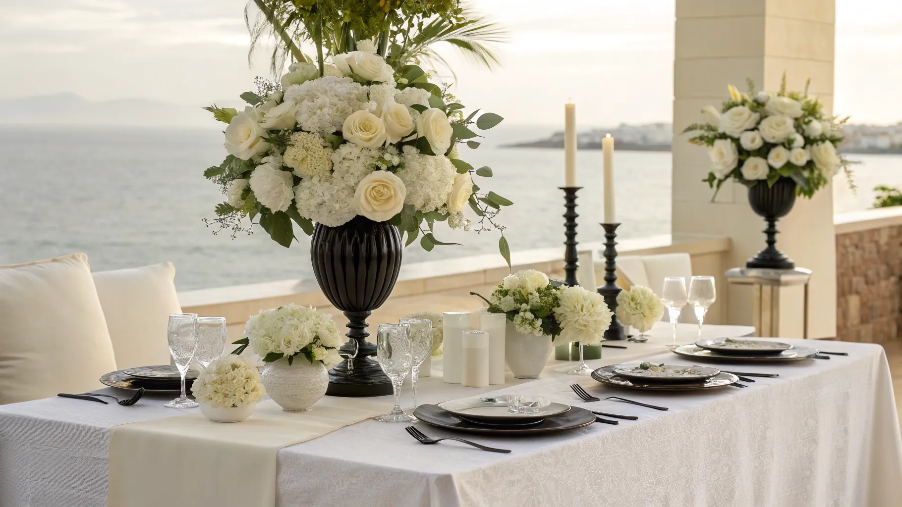
While black and white is technically a classic combination, a strictly stark black and pure white wedding theme can often feel more like a corporate gala than a romantic celebration. When applied without softer transition colors, this high contrast palette tends to look flat and rigid in photographs. It also places immense pressure on the decor to be perfectly symmetrical and modern, which does not always align with the organic joy of a wedding day.
- To modernize this look, introduce variations of white, such as ivory or cream, to soften the visual impact.
- Incorporate metallic accents like brushed gold or champagne to add warmth and dimension.
- Consider using charcoal gray or midnight blue as a softer alternative to stark black for bridesmaid dresses and table linens.
4. Burlap Tan and Mason Jar Teal
The rustic chic wedding trend brought the combination of natural burlap tan and bright teal to the forefront of the wedding industry. While this style championed a relaxed, countryside aesthetic, the literal translation of burlap and bright blue glass has become visually exhausted. The textural contrast often feels forced, and the specific teal shade frequently used in this theme can look artificial against natural wooden environments.
Couples aiming for a rustic or countryside feel are now embracing elevated naturalism. Earth tones like terracotta, rust, mustard, and deep forest green blend much more seamlessly with outdoor environments. By utilizing natural linens and dyed cotton instead of rough burlap, the tactile experience of the wedding feels much more refined and comfortable for guests.
5. Overly Saturated Rainbow
Incorporating every color of the rainbow in highly saturated, primary hues was a trend aimed at creating a fun and whimsical environment. Unfortunately, using bright red, yellow, green, blue, and purple in equal measure usually results in a chaotic and disjointed aesthetic. Without a dominant color or a neutral base to anchor the design, the eye struggles to find a resting place, making floral arrangements and venue decor look more like a festive party than a formal celebration.
If a multicolored palette is desired, the current approach focuses on tonal variety or pastel interpretations. A sunset palette, featuring gentle gradients of peach, coral, pale yellow, and soft pink, provides a multitude of colors while maintaining harmony. Sticking to a specific color family rather than the entire color wheel ensures the event remains vibrant but elegantly curated.
6. Fire Engine Red and True Black
Historically chosen for winter weddings or Valentine-themed celebrations, the pairing of bright fire engine red and true black is another high-contrast theme that feels dated. This combination is incredibly intense and often creates a theatrical or dramatic atmosphere that borders on severe. In floral arrangements, bright red roses wrapped in black ribbon can look heavy, drawing too much focus away from the couple and the surrounding venue.
For those who love the romance of red, a shift toward deeper, more complex shades is highly recommended. Burgundy, merlot, and oxblood paired with softer darks like navy or charcoal create a romantic, moody atmosphere without the starkness of true black. Adding a touch of blush or mauve can further soften the look, providing layers of depth and sophistication.
7. Pale Yellow and Slate Grey
This color combination gained massive popularity in the 2010s, praised for balancing cheerful warmth with modern industrial coolness. However, the exact pairing of pale, buttery yellow with flat slate grey has been so overused in both weddings and home decor that it has lost its unique charm. The cool undertones of the grey can sometimes make the yellow appear washed out, leading to a lackluster environment that lacks the vibrancy a wedding day deserves.
- Replace slate grey with warmer neutrals like taupe or sand to complement yellow tones naturally.
- Opt for richer, deeper yellows such as mustard, ochre, or saffron to add modern vibrancy.
- Introduce organic greenery to bridge the gap between the yellow accents and the neutral base colors, creating a fresh and lively setting.