10 Color Mistakes That Make Your Home Feel Dated
Color has a powerful impact on the mood and style of a home. While personal taste is always important, certain color trends and application mistakes can anchor your space firmly in the past. Understanding these common pitfalls can help you choose a palette that feels fresh, modern, and timeless for years to come. Whether you're planning a full renovation or a simple refresh, avoiding these ten color errors is a great place to start.
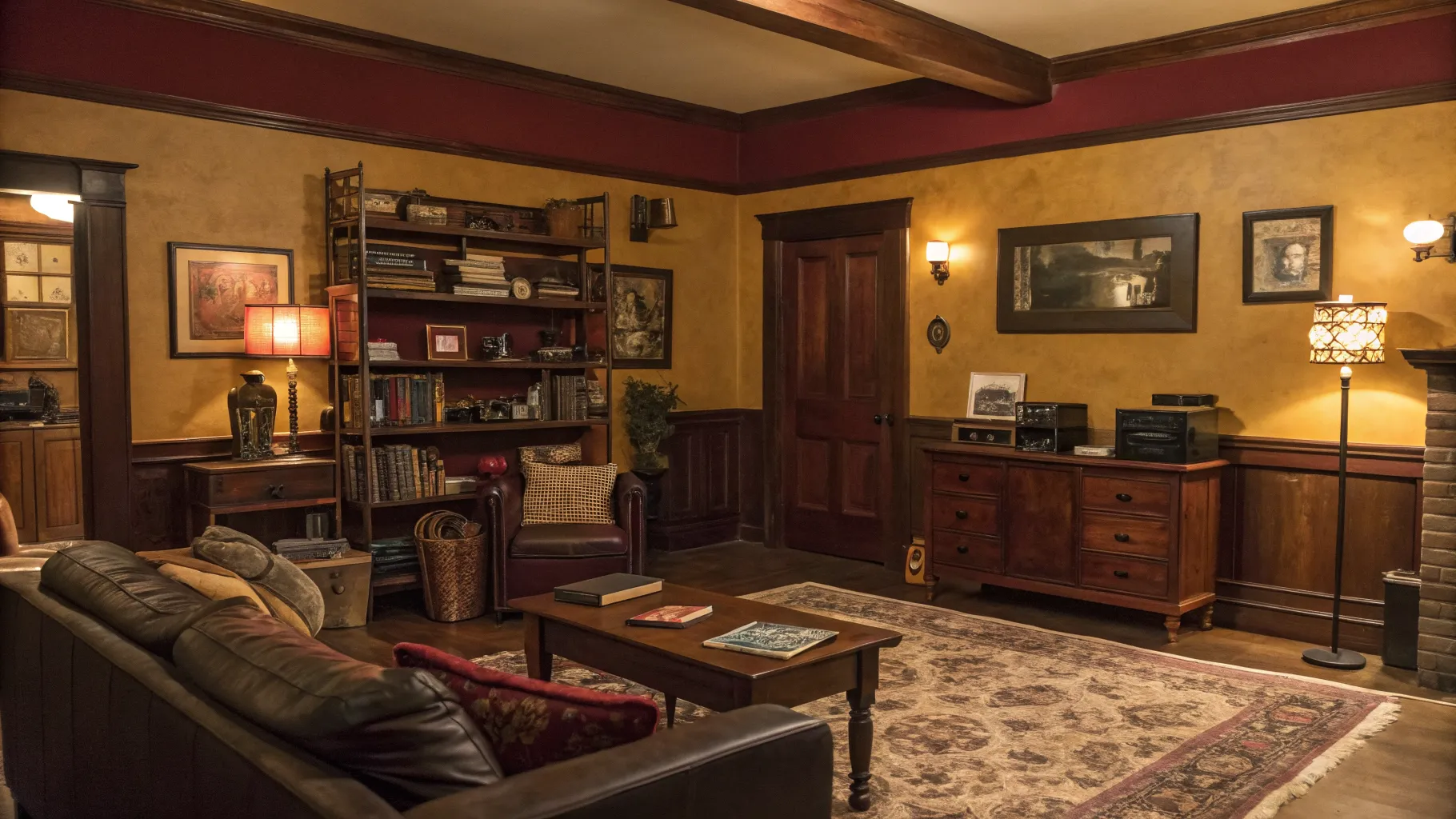
1. The Tuscan Gold and Burgundy Overload
In the early 2000s, warm, earthy tones like deep gold, terracotta, and burgundy were incredibly popular. This trend, often called the 'Tuscan' style, aimed for a cozy, old-world feel. However, when used excessively, these saturated colors can now make a room feel heavy, dark, and distinctly dated. Walls painted in a strong Tuscan gold, especially when paired with a burgundy accent wall, can absorb light and make a space feel smaller than it is.
For a more modern approach to warmth, consider lighter, more nuanced shades. Think soft terracottas, muted ochres, or warm off-whites. These colors provide a similar cozy feeling without the overwhelming saturation. Pairing them with natural textures like wood, linen, and stone creates a sophisticated and timeless look that is bright and inviting.
2. Relying on an Outdated Accent Wall
The concept of an accent wall is not inherently dated, but the execution often is. The classic 2000s approach of painting one wall a bold, contrasting color like deep red or chocolate brown in an otherwise beige room can feel disjointed and random. This technique often chops up the space visually and draws attention to a single wall for no specific architectural reason, which can look jarring to the modern eye.
Today's accent walls are more integrated and intentional. They might feature interesting textures like wood paneling, wallpaper with a subtle pattern, or a slightly deeper shade of the main wall color for a tonal effect. The goal is to add depth and interest without creating a harsh contrast. If you want to use a bold color, consider painting the entire room, including the trim, in that shade for a chic, immersive experience.
3. Ignoring Color Undertones
One of the most complex but crucial aspects of choosing paint is understanding undertones. A gray might have a blue, green, or purple undertone, while a beige might lean pink, yellow, or green. A common mistake is picking a wall color without considering how its undertones will interact with the fixed elements in your room, such as flooring, countertops, and large furniture pieces.
When undertones clash, the entire room can feel 'off' without an obvious reason. A cool gray wall next to a warm, yellow-toned wood floor can look jarring. To avoid this, always test paint swatches next to these fixed elements. Observe them in different lighting throughout the day to ensure the undertones are harmonious and create a cohesive, intentional look.
4. The All-Beige Everything Approach
For decades, beige was the go-to neutral for homeowners and builders because it was considered safe and versatile. However, an over-reliance on a single shade of beige throughout a home, from the walls to the carpets and furniture, can result in a space that feels flat, uninspired, and reminiscent of 1990s suburbia. This monochromatic look lacks depth and personality.
If you love neutral colors, the key to a modern look is layering different shades and textures. Instead of one beige, create a palette of warm whites, soft greiges, and creamy ivories. Introduce texture through linen curtains, a wool rug, and wooden furniture. This creates a rich, layered, and sophisticated neutral space that feels anything but boring.
5. The 1980s Pastel Palette
The pastels of the 1980s and early 90s, particularly mauve, dusty rose, and seafoam green, carry a strong stylistic association with that era. While pastels can be used beautifully in modern design, these specific shades, especially when used together or on dated textures like popcorn ceilings, can instantly make a room feel like a time capsule. This is particularly true for bathrooms with matching colored fixtures.
To use pastels in a contemporary way, opt for more muted and sophisticated versions. A soft, earthy blush is a modern alternative to mauve, while a pale sage green feels more current than seafoam. Use them as an accent against a backdrop of crisp neutrals, and pair them with modern materials like matte black metal or light-toned wood.
6. Keeping Stark White Ceilings
The default choice for most ceilings is a flat, stark white. While this is not always a mistake, it is a missed opportunity for creating a more cohesive and professionally designed space. A brilliant white ceiling can create a harsh, high-contrast line where it meets the walls, especially if the wall color is dark or saturated. This can make the room feel less enveloping and can even make the ceiling appear lower.
Consider painting the ceiling a lighter version of the wall color or a soft off-white that complements the wall's undertones. This blurs the line between the walls and ceiling, making the room feel taller and more seamless. For a dramatic and cozy effect in a bedroom or dining room, you could even paint the ceiling the same color as the walls.
7. Clinging to 1970s Harvest Gold and Avocado
No color combination screams 'dated' quite like the harvest gold and avocado green of the 1970s. These colors were ubiquitous on everything from kitchen appliances and countertops to shag carpets. While retro styles can be fun, these particular shades are so strongly tied to their decade that they are very difficult to incorporate into a modern home without it looking like a movie set.
If you are drawn to these colors, look for their modern counterparts. Avocado can be updated to a deep olive or a vibrant sage green. Harvest gold can be swapped for a more sophisticated mustard yellow or a rich brass metallic finish. Using these updated shades provides a nod to the retro vibe while feeling firmly planted in the present day.
8. Overly Matched Color Schemes
Creating a cohesive color scheme is important, but taking it too far can make a room feel stiff, sterile, and dated. In the past, it was common to buy matching sets where the curtains were made from the same fabric as the throw pillows and the lampshade. This 'matchy-matchy' approach lacks the curated and collected feel that defines modern interior design.
Instead of matching colors and patterns exactly, aim for a coordinated palette. Choose three to five colors and distribute them throughout the room in varying shades and intensities. Mix different patterns, like a floral with a stripe, as long as they share a common color. This creates a room that feels personal, dynamic, and thoughtfully put together over time.
9. Dark Wood Tones with Dark Colors
The 1990s and early 2000s saw a prevalence of dark wood finishes, like cherry and mahogany, on cabinets, floors, and furniture. A common mistake from that era was pairing these heavy wood tones with equally dark and warm wall colors like deep reds or forest greens. This combination can make a room feel cavernous, somber, and visually heavy.
To modernize a space with dark wood elements, create contrast with light and bright wall colors. A crisp, warm white or a very light greige can instantly lift the room, making the wood's richness a beautiful feature rather than an oppressive element. Improving the lighting, both natural and artificial, will also help balance the dark tones and create a more inviting atmosphere.
10. Forgetting to Test Colors in Your Light
Perhaps the biggest mistake of all is choosing a paint color based on a small chip in a brightly lit store and applying it directly to your walls. The lighting in your home is unique and will dramatically alter how a color appears. A north-facing room receives cool, indirect light that can make colors look bluer, while a south-facing room's warm light can intensify yellow and red tones.
Always buy a sample pot of your top color choices and paint large swatches on different walls in the room. Observe how the color changes throughout the day, from the bright morning light to the artificial lighting at night. This crucial step ensures that the color you loved in the store is also the color you will love in your home, preventing a costly and frustrating mistake.